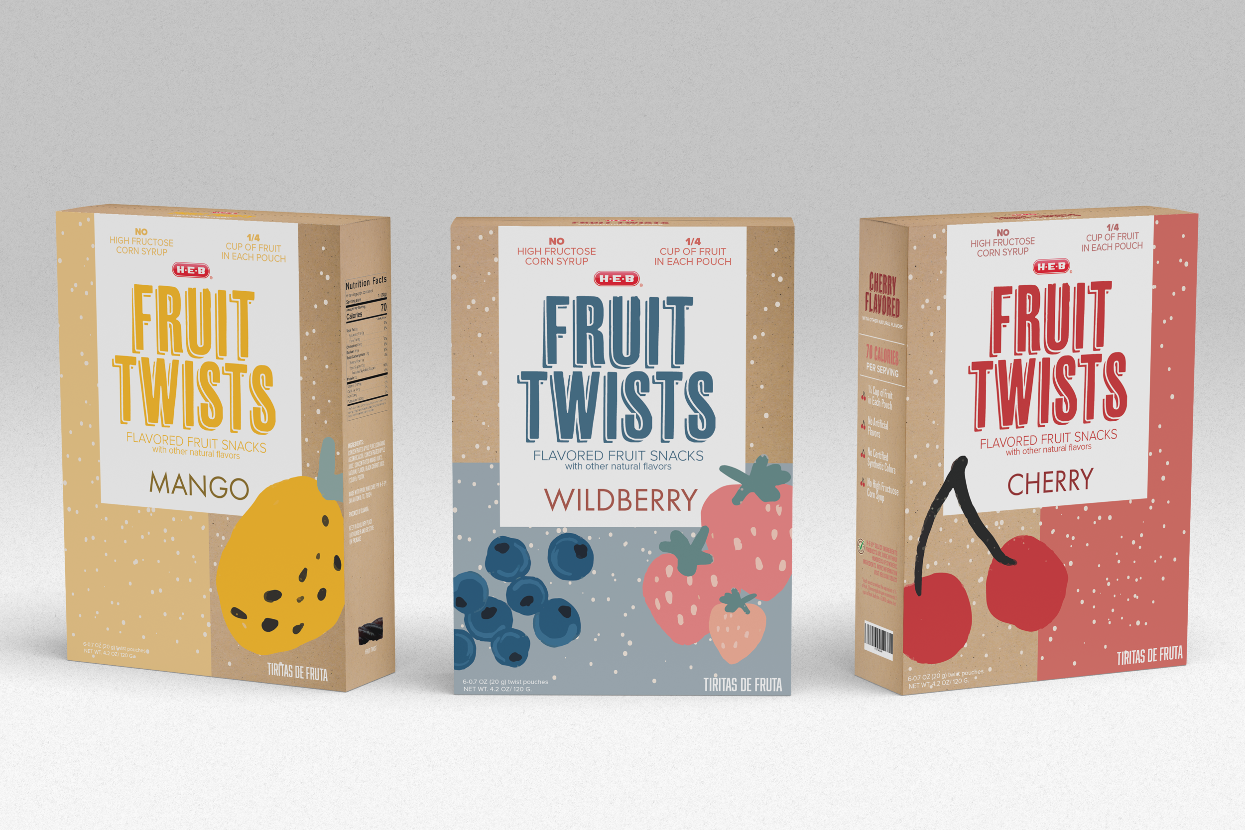
FRUIT TWISTS
Packaging Re-Design

The goal of this project was to re-design a package of an existing product.
I really liked how this project panned out. It’s a product to be consumed by mostly kids, but it had to call the parent’s eye. The main goal was to make it look attractive and healthy, but at the same time playful. This was achieved by keeping the box a natural color and bringing in those old-school games of cereal boxes so that the kids could entertain themselves while in the car or in a picnic.
Target Audience:
Young moms with children of 3-12 years old who are looking for a healthy snack for their kids.
Requirements:
Re-design the packaging of an existing product. It had to be in a box.
This product belongs to a known grocery store brand in Texas. The goal was to make it more playful to call the attention of parents and kids alike.
Mood Board Goal
For this project I made two mood boards because I wasn’t sure which direction I wanted to take: the colorful
one, or the more sober one. In the end I chose the more sober one with a cardboard box, because I thought
that would call into the parents when thinking of more sustainable packaging. For me, more subtle colors also convey healthier ingredients.

The design above this text is the final design I presented in class. After some extra consideration and feedback, I decided to revamp the packaging even more and create some more flavors to see how the boxes would look together. I changed the fruit icons and kids a little bit, and with this I achieved the aesthetic I was going for in the beginning. The colors used give it a more subtle and different look, and I believe they would stand out in the fruit snack aisle for sure.
Reflection
Getting a product and package that already exists and making it better was an exercise I really liked. It made me think of how many brands out there are targeting their clients, and what can be done to make a better design without the cost going up. I also learned a lot about what had to be included in each box, like ingredients and certain regulations that exist for packaging. I love the end result and it’s one of my favorite projects.


